Because we are about so much more than just swapping!
Name: Muezli
Token name: Milk (no change)
Theme:
A futuristic UI evoking a sense of security and technological competence while not taking itself too seriously
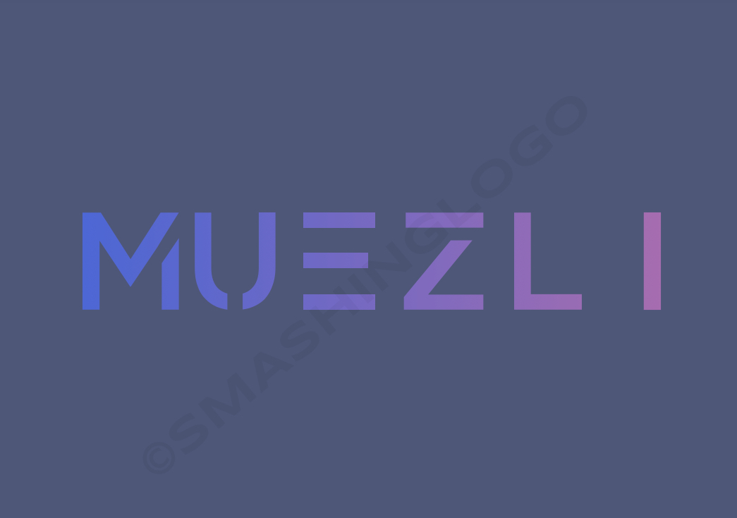
Logo and icon:
A slick text based logo with a gradient colour palette, as below
Rationale:
The [food]+Swap style of branding DEXs has now been done to death. What started off with SushiSwap and Pancake Swap has now been copied in pretty much every way imaginable and is no longer fashionable for new projects. The simplified ‘Muezli’ allows us to keep much of the well-loved brand identity while also broadening the meaning, allowing the brand to be associated with a suite of decentralised financial services - not just swapping! MuesliSwap is also currently colloquially reffered to as ‘Muesli’ - so it is not a big change. There is however a suggested change in brand identity: moving away from the cartoon cereal bowl image in favour of a more professional looking text-based logo.
It is also spelled phonetically, allowing people who are unfamiliar with the muesli cereal to pronounce it correctly. This will also allow for better SEO and brand recognition.
TLDR: remove ‘swap’ from the brand name and make the brand identity a bit slicker!
In the rebranding section on Discord: Discord